academic works
senior capstone: malleable surface


‘Malleable Surface’ explores various relationships between surface, body, and container through the invention of a new, reconfigurable system. In this instance, the system is shown in a train application to show how it functions when spatial conditions are restrictive. However, the malleable surface system would theoretically be able to be implemented in other types of spaces as well.
Surface functions throughout the project as a container for the body, and hangs along various datum lines that respond to human body proportions. The malleable and formable property of the surface material means it adheres to the body in a wearable manner, strengthening the physical relationship between surface and body. The container and existing train surfaces host three mechanical systems to support the flexibility of the surface: a hook and grommet system that anchors the surface in place; a rod system that allows the surface to slide both horizontally and vertically across the space; and a track system in the floor that the dining tables are able to slide across to correspond with the chosen malleable surface configuration. In addition to the primary systems, there is a secondary lighting system in the dining cars that runs along a similar set of ceiling rods as inside the sleeper cars.
deconstructed workplace


Considering the programmatic zones: reception, conference room, restrooms, work desks, break out spaces, library, and kitchen, deconstructivist spatial techniques were applied to control the users function within each of the spaces. From the entry, to the reception, to the conference room, and private work area: the floor and ceiling patterns mirror one another in order to emphasize zoning and circulation. Repeated linear aspects are employed throughout, with changes in ceiling heights, and angular shifts in the surrounding walls and surfaces. Inspired by Frank Lloyd Wright's methods of compression and release, the ceiling portion of the reception area extrudes portions of the linear pattern down into the space as a method to control the speed of circulation, whilst also allowing for integrated lighting opportunities in line with deconstructivist techniques.
Entering the conference area, release is experienced as the room expands upwards, and natural light filters into the space through a slanted skylight atop the double-height space. The surrounding walls, made from frosted, vertically-fluted glass push you towards the entry of the conference room, in what feels like a linear tunnel. The conference room itself is also a double-height space, and features built-in furniture that continues to align with the floor and ceiling patterning.
The private area of the office building is divided in two, one half with a dropped ceiling similar to that of the circulation sequence. The taller space is assigned to the work desks, which are adjacent to a full height window with vertically-fluted glass, that gives the main work area access to natural light. The dropped ceiling sits above the break out, heads-down space and library. The far corner of the private portion of the building features a beanbag corner, with another skylight above - natural light once again being utilized in order to create a more open, and relaxing atmosphere.
poetry foundation, cincinnati


Inspired by the program of the existing poetry foundation in Chicago, there were six main spaces in this project: a reception, a performance space, a gallery space, a library space, a private space, and an exterior space. In this design, these six spaces were simplified into three merging forms, each representative of the narrowed down zones: public, private, and core. Within the public zone are the reception, performance, gallery, library, and exterior spaces. The private area contains printing rooms, offices, and a meeting room. And the core contains restrooms, elevators, and emergency stairs. The site for this project is the corner of Race and 14th Street in Cincinnati, Ohio, which faces Washington Park, a popular location for several creative events held throughout the year. There are two entrances into the building: one, with the main reception area, located on Race Street which faces the park; and one on 14th Street, intended for side entry.
From the main entry, you have immediate access to both the gallery and performance spaces, which are both located on the GF, separated by a single wall. The gallery space is located on the south side of the building, with vertical slats on the facade to control the bright morning/afternoon light. The performance space features a full-height atrium through the center of a building, with a skylight atop. A large seating area and staircase sits in the center of the space bringing the gallery, library, and performance spaces together.
On the 1F, the gallery is continued, and the library begins. On the west facing side of the library, there is an overhang that capitalizes on its's location by overlooking Washington Park, additionally doubling as a reading area with seating and tables. Moving up to the 2F, the library continues, with and full-height shelving system, and enclosed meeting and reading rooms overlooking the center atrium and performance space.
The 3F and 4F make up the private sector of the building, and are oriented to the south, allowing for natural light to filter through the space. The 3F houses the printing and publishing area, whilst the 4F is designated to private offices and conference rooms. Both areas overlook the exterior space on the south side of the building.
The exterior space was designed as an alternate entrance, as well as a gathering space for both employees and visitors of the poetry foundation. It is composed of various 'L' shaped elements, which are repeated throughout the building in the form of both solids and forms. For instance, the roof surface, the curtain wall, the main facade.
dreamscape series
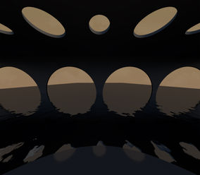
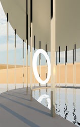
The dreamscape series is a theory based project that focuses on the role of the body in photographic representations of imagined spaces. Though the rendered dreamscapes are void of a physical interaction between body and space, the argument the project poses is that the inherent nature of the architectural image lends itself to a relationship between viewer and the depicted setting. Furthermore, the photographic representation of space allows the viewers to remove the body from its inherent functional role, and step into one of contemplation and interpretation. By separating the body from the physical experience of space, it enables the viewer to understand the rendered dreamscape through their own individualized lens and psychological interpretation of reality. The body becomes related to space not through practical function or activity, but through the implied actions that are understood intrinsically when confronted with an architectural setting. As a result, the photographic form lends itself to a unique and sensorial experience of built environments.
In the dreamscape images, the lack of both physical body and physical world lends itself to an equalized hierarchy between subject and object. What is seen in the renderings – mainly the biophilic relationship between nature and built spaces – becomes of equal importance as the person viewing the renderings. Thus, the viewers are faced with an image that challenges their relationship with nature, built spaces, and their sensorial connection to their bodies. The incorporation of biophilic elements such as water forms, light, shadow, and pattern in the renderings on some occasions surpass the bounds of reality, allowing for an element of the impossible that further encourages an imaginative and sensorial interpretation of the depicted dreamscapes and the viewers’ relationship to the space.
The symbolic representation of the body throughout the dreamscape series avoids anthropomorphic forms in order to avoid depictions of the body as something that is measurable, mechanical, and manipulable. Instead, the body is depicted where applicable in its natural and pure form to support the idea that the body is an entity of free-will and individualized thought. This becomes an important part in encouraging the viewers to reach an interpretation of the rendered dreamscapes that aligns with their individual experiences, and that allows them to deeply examine their relationship to the imagined spaces. As a whole, the body functions within these rendered dreamscapes in two ways: as a symbol of free-will, individual power, and independent thought; and as a sensorial tool – a projected body - that allows the viewer to imagine themselves in an impossible unreality bringing them closer to an understanding of their relationship to nature, interior spaces, and their own sensing bodies.
regenerative hospital


Activity in hospitals is often stressful, with users experiencing various degrees of positive and negative emotions. Looking at the extremes of these experiences, there is the juxtaposition between life and death. The concept of regeneration looks to break the polarity of this juxtaposition through the revival of discarded and recycled materials to create an entirely new, regenerated product. In doing so, there is a middle ground where past, present, and future exist simultaneously. Recycled glass and plastics are used to create a terrazzo. Old pill bottles are repurposed to create a transparent brick that filters colored light into the space. Melted and molded plastic bottle caps are used to create coffee tables, chairs and other furnishing items. And cork, which is naturally regenerative material, is applied to looping, three-dimensional forms. Overall, the material properties are represented in the solid and void forms, and the application of such materials becomes a metaphor for regeneration - where life and death coincide.
Light and transparency of material will be used in combination with one another to represent a transference of life into the space. As the natural sunlight travels through the transparent, recycled materials, it activates the regeneration of the interior space, demonstrating a new connection between new and old. The light that lives within the interior space is an end result of the past, present, and future coming together. The intended effect of this is to create an atmosphere that elicits feelings of hope, optimism, and growth for hospital visitors that may be experiencing loss.
Vertical surfaces throughout the hospital are composed of smooth curves in order to create a flowing circulation path, a clear sense of direction, and to establish spatial continuity. This continuity relates back to the idea regeneration, and giving objects an infinite life. In addition, by utilizing curves, the overall square footage of the space is maximized, which is in itself a sustainable action. Disjointed surfaces, awkward angles, and various distractions are avoided by using curved edges, which helps to simplify the overall perception of space, and assist with user navigation. With a minimalistic appearance, the architectural forms and applied materials are able to be better recognized and appreciated, which allows the symbolic properties of the material to be observed.
The only instance where harsh edges are intentionally applied are in the cutouts seen in the terrazzo material in the same-day-surgery entrance. These specific cutouts are intended to represent the fragmented properties of terrazzo, thus enabling users to gain a better understanding of the material seen throughout the space. In doing so, it brings attention to the recycled objects found within the terrazzo, encouraging users to identify the found objects and to engage with their surrounding environment. In addition, it lets users recognize the history of the material, and appreciate its regenerative qualities.
Three-dimensional forms throughout, such as the coffee tables, built-ins, and the interactive structures in the play areas, also utilize smooth edges and flowing curves. As a result, a clear design language is established that ties the various spaces together. For the most part, loose furnishing items are avoided as a way to keep the space minimalistic. In doing so, the overall forms are emphasized, as well as their materiality. The use of built-in also helps to create a sense of permanency to the program, which I believe is important to maintaining a sense of order throughout the hospital. Designing each space with intention and with consideration of the various user groups allows for the overall program to be successful.


